Designing Custom Document Themes: Brand Your Markdown with Zero CSS Maintenance
Build custom document styles in Prisment — colors, fonts, and headings — then save, share portable theme files, and carry them in exported offline HTML.
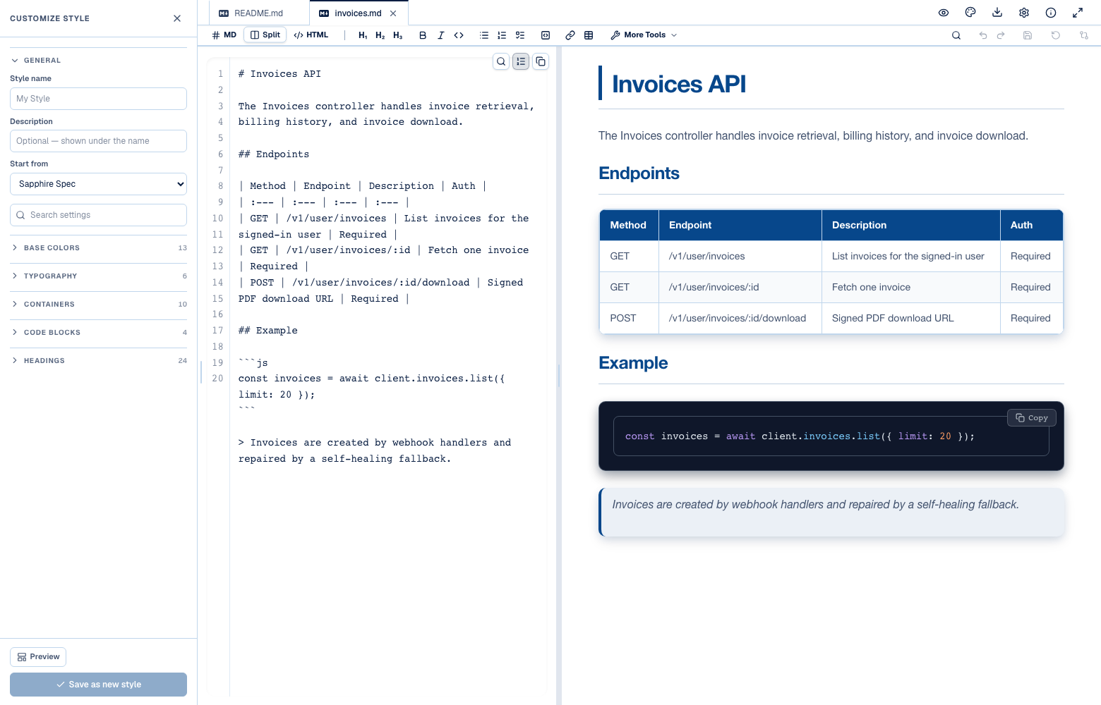
Five built-in presentation styles cover a lot of ground — they are surveyed in turning raw AI Markdown into presentation-grade HTML — but they are somebody else's five. If your team has an accent color, if you want Sapphire Spec's layout on a dark page, or if you simply think h2 deserves a left rule rather than an underline, you need to change it rather than choose from a list.
The style customizer does that, and — the part that matters — what you build is saveable, shareable as a file, and carried inside the documents you export.
1. Start from a preset, not from nothing
A custom style is a delta over a preset, never a stylesheet from scratch — you change the handful of values you care about and inherit everything else. That is why a style of six changed values is still a complete style.
Open the Style menu and every row has a customize control on it. Click it on a built-in preset and you get a new style based on that preset; click it on one of your own and you open that one for editing.
This is deliberate. A style is a delta over a preset, not a stylesheet from scratch — you change the handful of things you care about and inherit the rest. Two consequences worth knowing:
- You only store what you changed, so improvements to the underlying preset still reach your style.
- You can start from the preset whose layout you want and change only its colors.
Four layers decide what a document looks like, and your style is the last of them:
Each layer only overrides the one before it, which is why a style of six values is a complete style: everything you did not set is still being answered further up the chain.
Tip
Preview with the Built-in Sample Document. The panel footer has a Preview Sample toggle that swaps your document for a pre-loaded showcase containing every element a style can touch — all six heading levels, tables, code blocks, quotes, callouts, and collapsibles. This lets you inspect how your colors and radii look across all elements in real time.
2. The five configuration groups
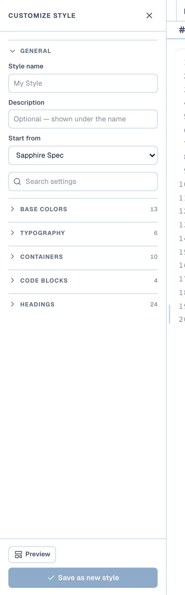
Fifty-seven controls sit in five groups: Base colors, Typography, Containers, Code blocks and Headings. Each is collapsed until you open it, and a search box reaches inside the collapsed ones.
General sits at the top — the style's name, an optional description, and the preset it starts from. Below it are the five groups that actually change how a document looks, each collapsed until you open it, so the first thing you see is the whole map rather than the inside of one section.
| Group | Controls | What it covers |
|---|---|---|
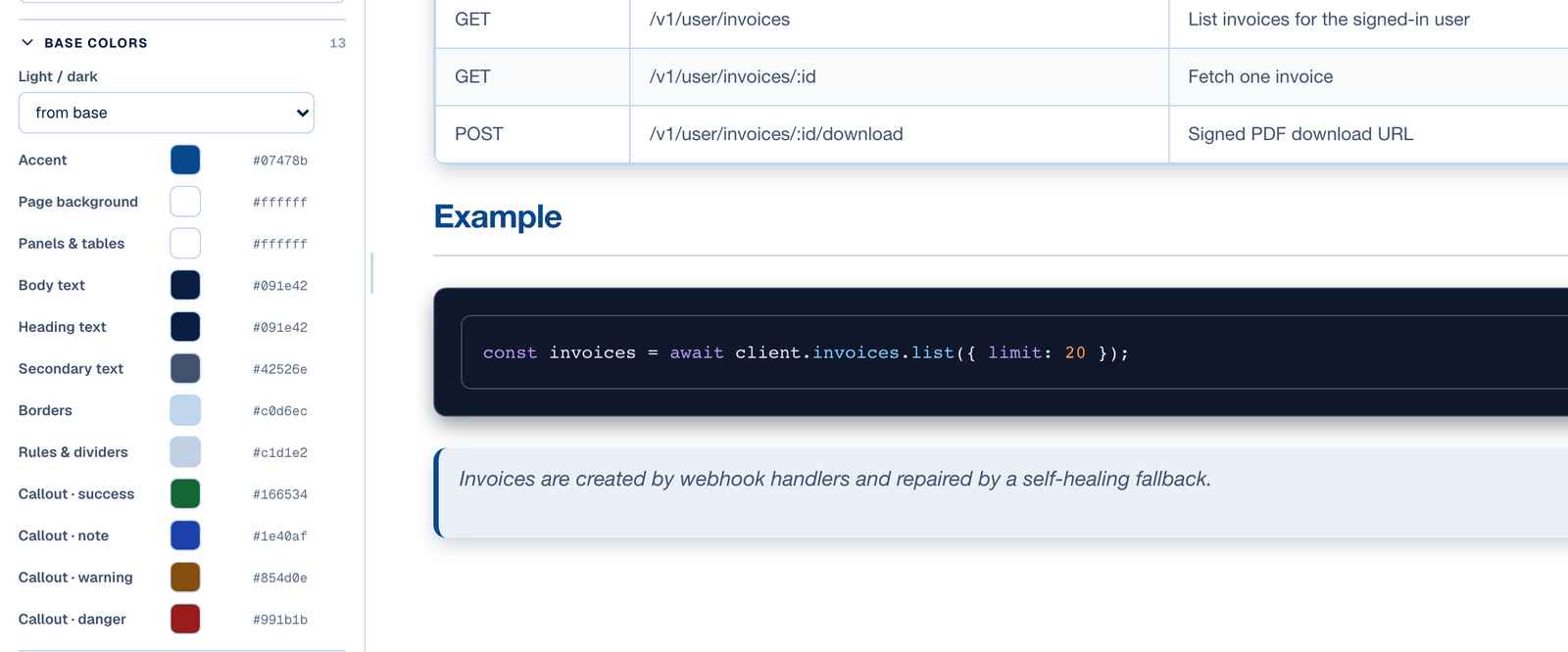
| Base colors | 13 | Light/dark, accent, page background, panels & tables, body/heading/secondary text, borders, rules & dividers, and the four callout colours |
| Typography | 6 | Body, heading and code fonts, text size, line height, link style |
| Containers | 10 | Border weight and colour, shadow, corners, table rows, table border colour and style, table header background and text |
| Code blocks | 4 | Block background, inline-code background, an inner frame drawn inside the block, and the syntax palette |
| Headings | 24 | Per level, h1–h6: decoration, colour, size, numbered step marker |
Fifty-seven controls, and the panel is still short, because most of them are per-heading-level and live behind a level tab.
There is a search box, and it reaches into collapsed sections — type "accent" and you get the accent control without hunting for which group it lives in.
3. Light or dark, on any preset
The Light / dark control swaps the entire palette underneath any preset, not just the page background. It is what lets you express "Sapphire Spec, but dark" — and every control you set afterwards resolves against the palette you chose.
The first control under Base colors is Light / dark, and it is the one that makes the whole thing worthwhile: it is what lets you express "Sapphire Spec, but dark".
A preset only carries a delta over one of two palettes, so flipping this moves the entire palette underneath — page, panels, borders, code, muted text, the header chrome — not just a background color. Every other control you set then resolves against the palette you chose, and keeps doing so.
4. One color configures the whole accent family
Picking one accent colour generates five more: a button fill, a hover step, a soft tint, a strong step, and a contrast colour for text sitting on the accent. The contrast one is computed, so an unreadable chip is not a state you can reach.
Set the accent and you have not set one value. An accent needs a fill weight for buttons, a darker step for their hover state, a soft tint for backgrounds, a stronger step for emphasis, and a contrast color for text sitting on the accent.
Prisment derives all five from the single color you pick:
The contrast calculation is the one that matters: if you pick a pale yellow accent, text on buttons and chips becomes near-black; if you pick a navy, it becomes white. You cannot accidentally make an unreadable chip by choosing a color the template author did not test.
5. Per-heading styling and step markers
Every level from h1 to h6 carries four controls — decoration, colour, size and an optional numbered step marker — and each one defaults to "from base". Left on that default, it keeps resolving against the preset underneath.
Headings get their own group because they are what give a document its architecture.
Each level from h1 down to h6 has four controls:
- Decoration — plain, underline, left rule, left rule + underline, box, or an accent bar.
- Color — heading colour, accent, body text, or secondary text.
- Size — smaller, default, larger or largest, relative to the base type scale.
- Numbered step — a numbered pill before the heading text, the pattern Stepped Guide uses.
Every one of them also offers from base, which is the default: leave a control there and it keeps resolving against the preset underneath, which is what makes a six-value style a complete style.
Changing h2 to a left rule takes one click:
6. Saving, exporting and sharing your styles
A finished style can be saved to your browser, exported as a portable .json file, or carried inside an exported HTML document — and usually all three. The third is what lets a recipient see your colours without ever opening Prisment.
When you are happy with what you built, you have three ways to use it:
- Save in the browser: Name the style and click Save. It appears in your Style menu alongside the built-in presets, for every document you open on this machine.
- Export as a
.jsonfile: Click Export style to download a portable theme file. Commit it to your repository alongside your docs, or hand it to a colleague. - Carry it in exported documents: When you export a document to standalone HTML, the custom style is embedded in the file. The recipient sees your exact colors and fonts even if they have never opened Prisment themselves.
A documentation style is only as useful as its portability. By making custom styles lightweight deltas that serialize to standard JSON and embed directly into offline HTML, Prisment lets your engineering docs look distinctly yours without a line of CSS maintenance.
Related reading
- Standalone HTML & offline wiki export — how a style travels inside the file you send, and what each export option produces.
- Turning raw AI Markdown into presentation-grade HTML — the five presets your custom style starts from.
- Two-way visual Markdown editing — keeping one house style across a mixed engineering and product team.
Frequently asked questions
- Can I brand Prisment documents without writing CSS?
- Yes. Open the Style menu, click the customize control on any preset, and change colours, fonts, container chrome and per-heading rules through the panel — 57 controls across Base colors, Typography, Containers, Code blocks and Headings. No stylesheet is ever written or maintained.
- Do I have to build a custom style from scratch?
- No. A custom style is a delta over a preset, so you change only what you care about and inherit the rest. Any control left on 'from base' keeps resolving against the preset underneath, which is why a style of six changed values is still a complete style.
- Can I share a custom style with my team?
- Yes, in two ways. Export style downloads a portable .json file you can commit beside your docs or hand to a colleague. And any document you export to standalone HTML carries the style inside the file, so the recipient sees your exact colours and fonts without ever opening Prisment.